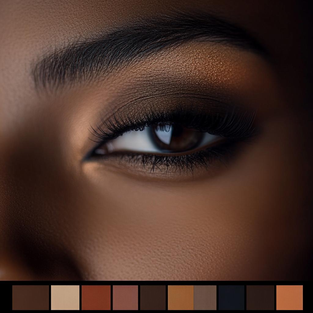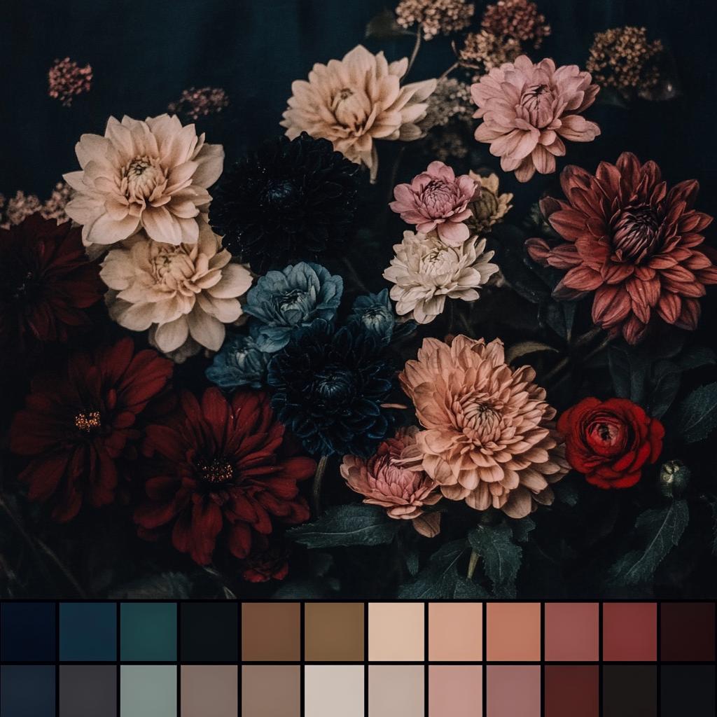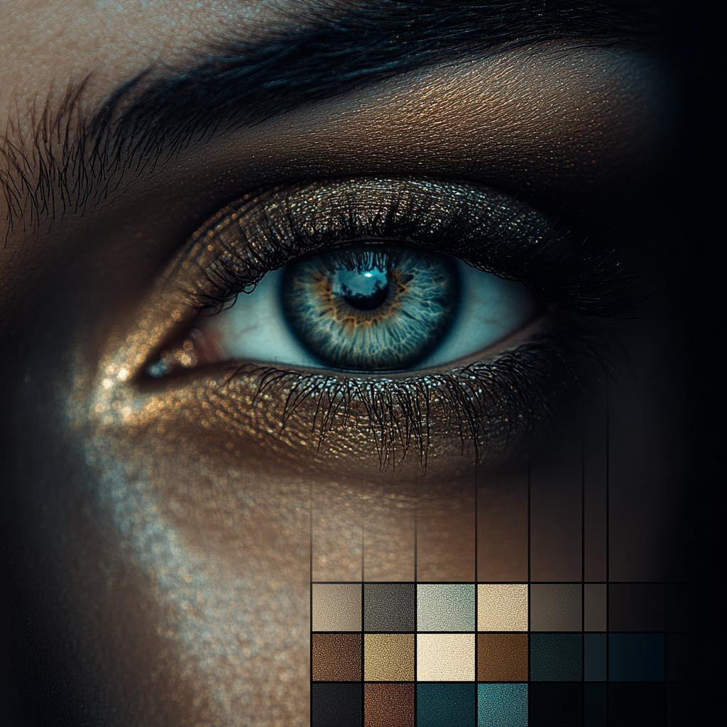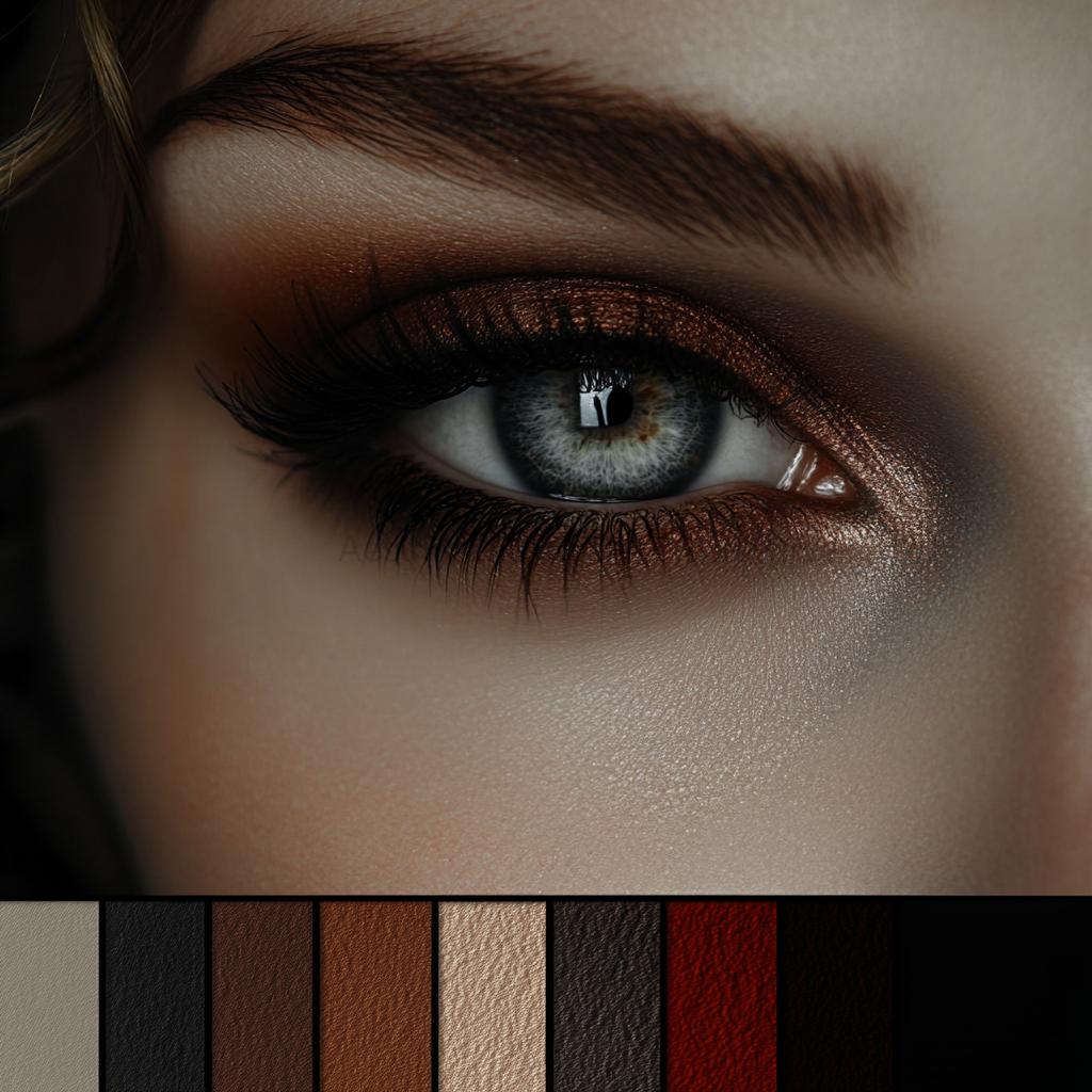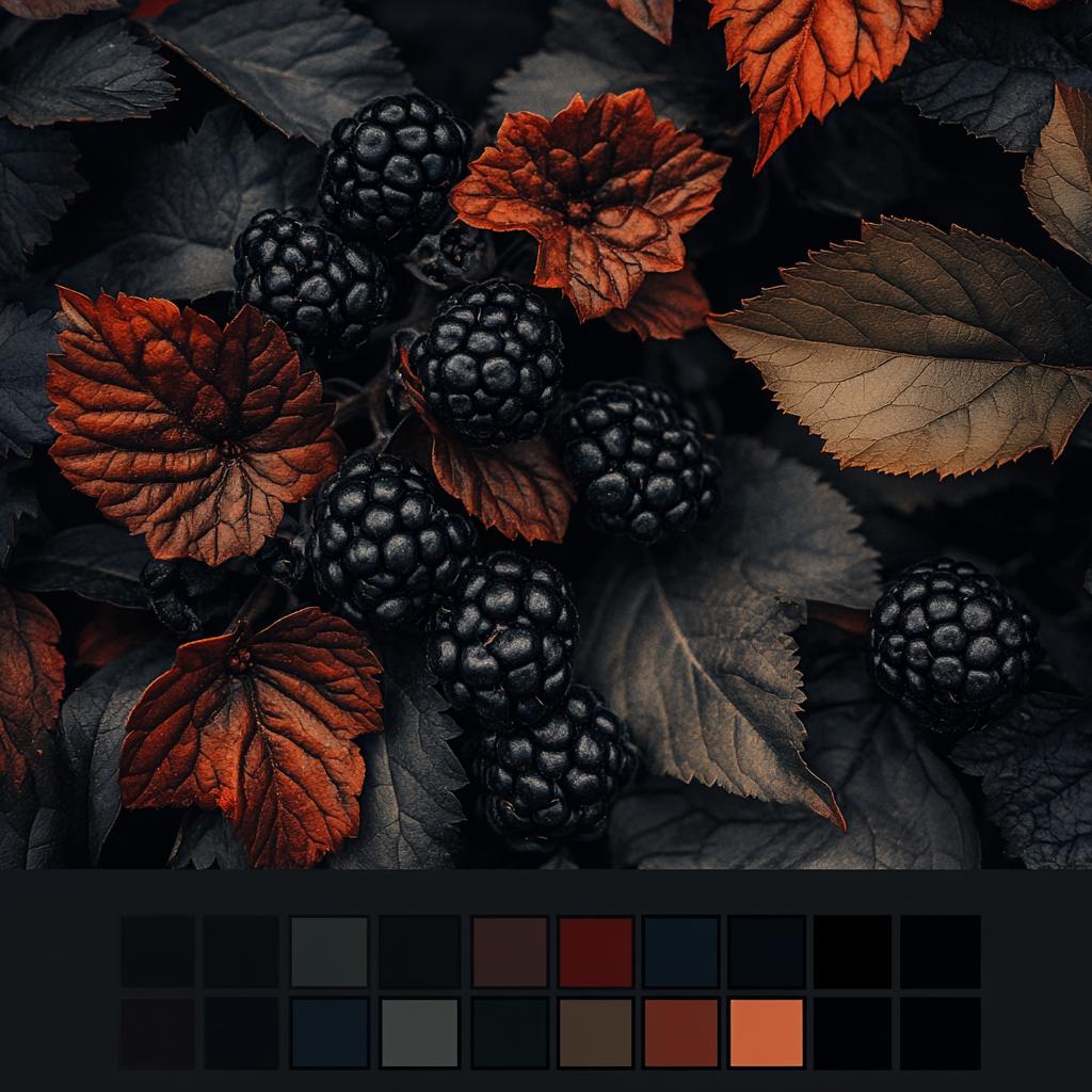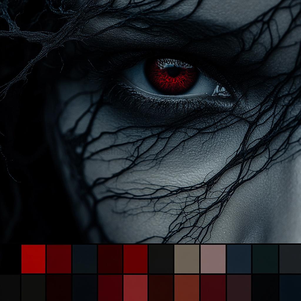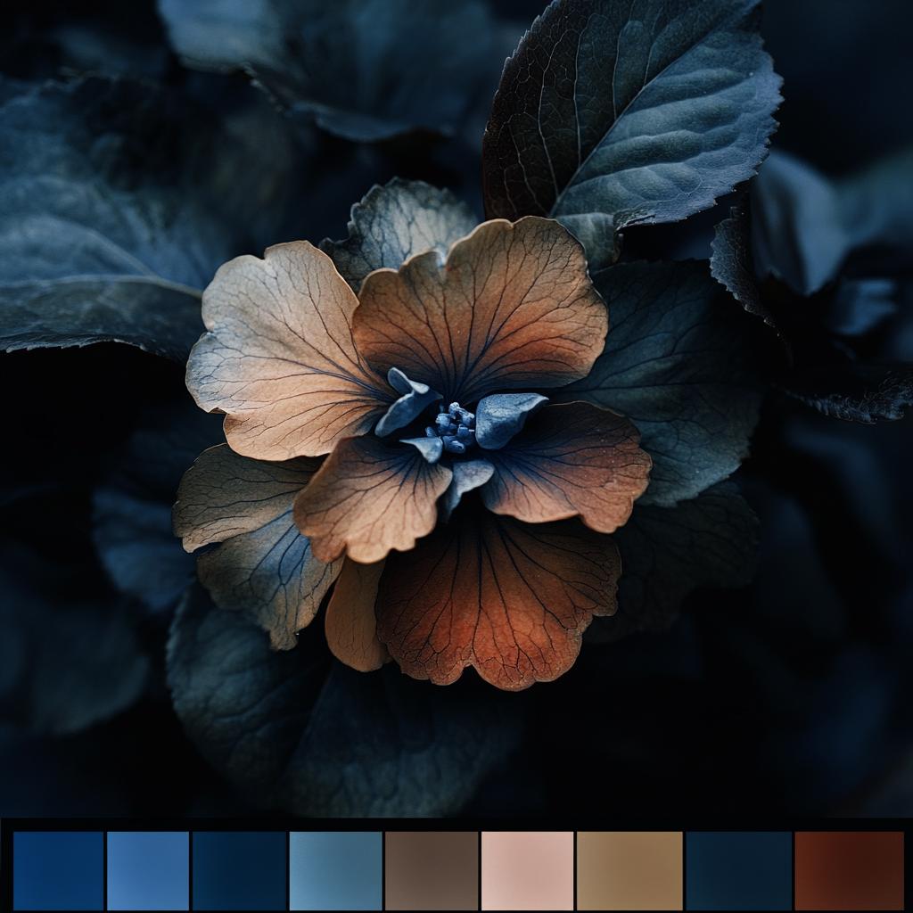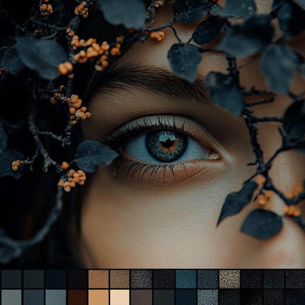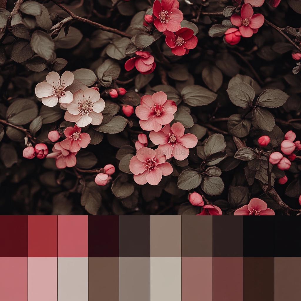
Dark color palettes are like a fine cup of coffee—rich, bold, and mysteriously addictive. Whether you’re designing a website, revamping your living room, or just admiring the sheer elegance of deep hues, there’s something undeniably captivating about them. These palettes evoke emotions ranging from cozy warmth to dramatic intensity, proving that darkness isn’t just about shadows—it’s about depth, sophistication, and a touch of rebellious charm. If you’ve ever found yourself mesmerized by the deep blues of a midnight sky or the velvety black of an espresso, congratulations—you’re already a dark palette enthusiast.
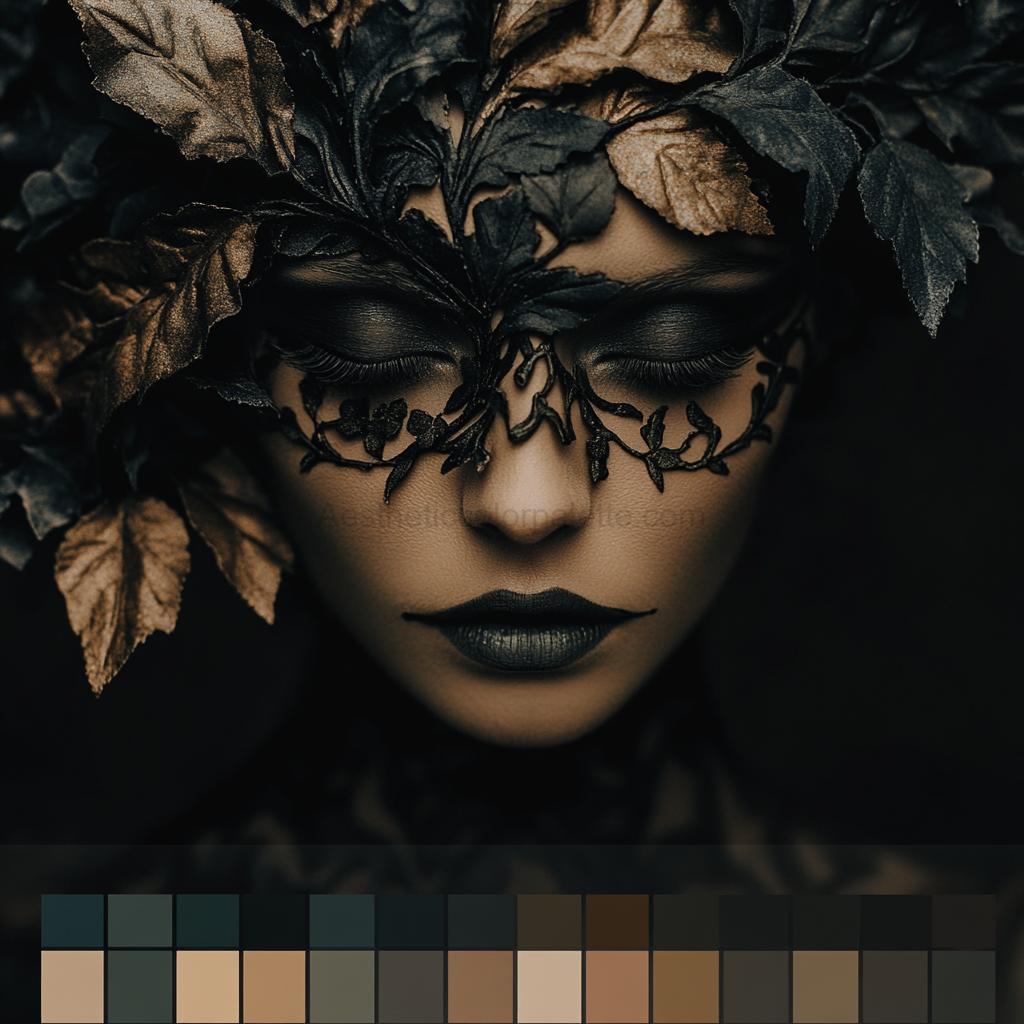
But let’s address the elephant in the dimly lit room—are all dark color palettes the same? Absolutely not! Some lean towards moody neutrals, while others embrace rich jewel tones, mysterious charcoals, or even dusky pastels. The magic lies in how they blend together, creating visual intrigue that makes people stop and stare (or at least, hover their cursor for an extra second). Whether you’re aiming for a modern minimalist vibe or a gothic-inspired aesthetic, dark tones offer a versatile canvas that can be as cozy as a candlelit library or as striking as a noir film set.
Now, before you go thinking that dark color palettes are just for Halloween decorations or brooding artists, let’s set the record straight—they’re timeless. Luxury brands, high-end interior designers, and even tech companies swear by the power of deep hues to convey class, mystery, and confidence. So, if you’re looking for design inspiration that’s equal parts stylish and dramatic, buckle up—we’re about to explore the mesmerizing world of dark color palettes and why they deserve a permanent spot in your creative arsenal.